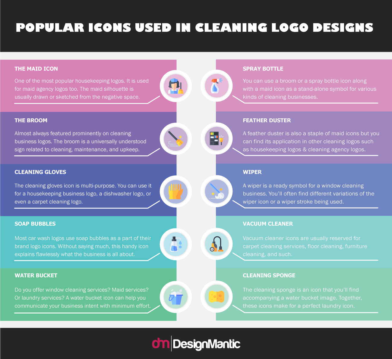
Icons are an important part of graphic design. As pictures and symbols, they help us understand a lot of the context and the story that the graphic is trying to tell us. When designing brand logos, icons become even more important as designers rely on them to carry the brand message across. When you are designing a cleaning business logo, for example, a maid logo or a feather duster icon will immediately tell people that the core business is about cleaning, without you having to say anything.
Icons feature prominently in almost all kinds of logo styles – except for typographical logos. Whether you are designing a pictorial logo for your cleaning company design project or going for a combination mark, the cleaning icon is going to be the hero of the canvas.
The icon design range for cleaning logos is quite varied. The many symbols like maid illustrations, duster icons, wiper icons, and such, are popular and easily understandable icons by the masses. While most businesses try to stick to just one icon to follow minimal designs for their brand logos, there are enough cleaning company logos with multiple icons that you can take inspiration from.
Related: 20 Fantastic Flat Icons And Their Meaning In Logo Design
Using multiple icons can help. This approach is especially useful for cleaning services that offer more customized cleaning solutions or just more levels of cleaning services. For example, if you run a housekeeping agency and offer house maintenance or house supervision services as well as maids for the daily upkeep, you might want to make use of more than one icon in your brand logo.
It will help people know that you’re a kind of one-stop-shop and may attract more niche buyers towards your establishment.